Ninjamas by P&G

Boldly
Breaking
Through

CHALLENGE
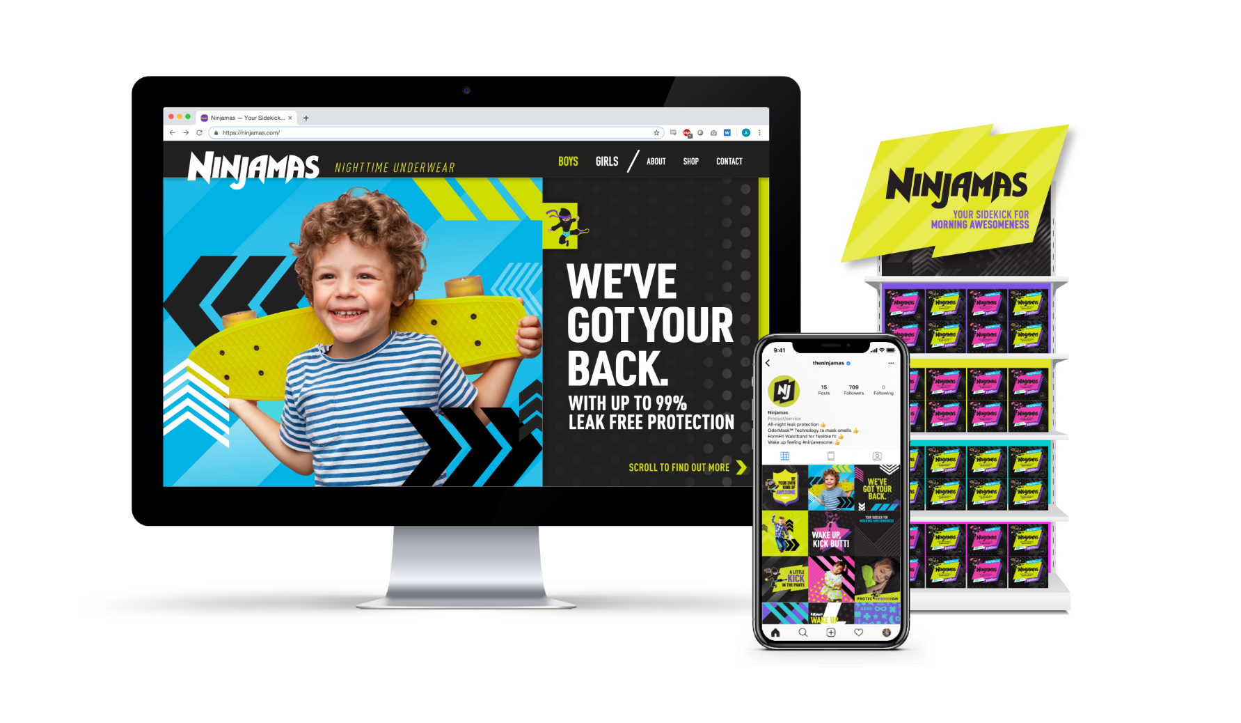
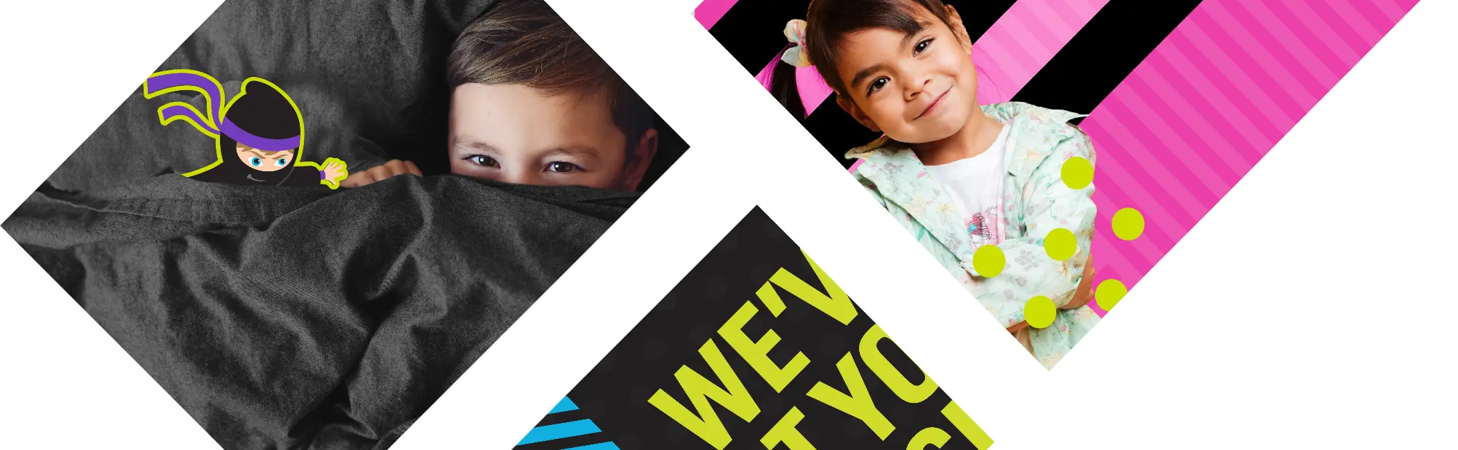
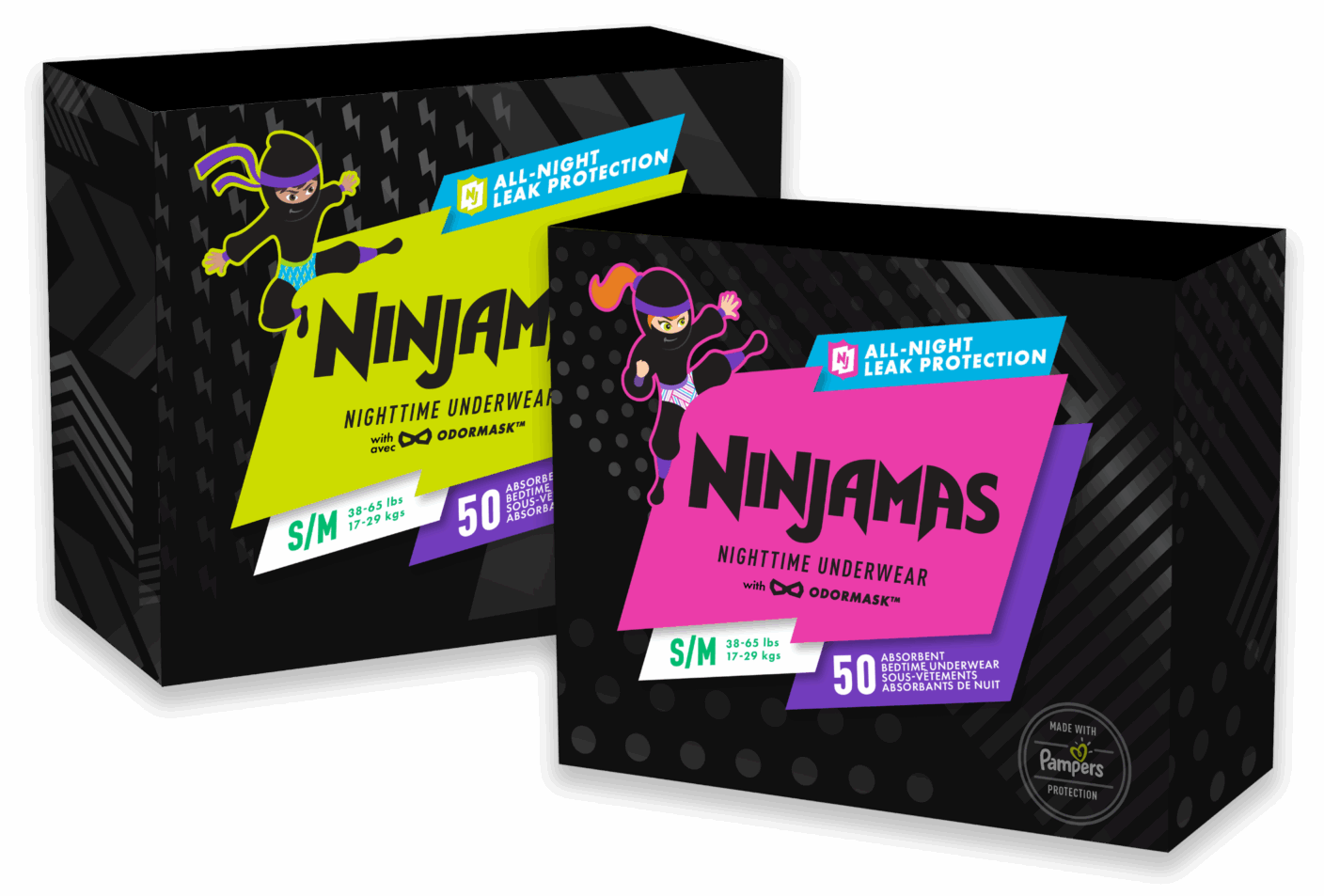
Bring a jolt of energy to the sleepy bedtime underwear category by reinventing a tired brand.
SPICEFIRE PERSPECTIVe
We worked with P&G to create a new visual identity for Ninjamas that threw out all the category norms. Our key insight is that 7-year-olds want to feel 17 - so cute characters on pack were in fact were making ‘big kids’ feel more babyish and embarrassed. We wanted empower kids to feel like the strong force of nature they are. Our visual identity was inspired by youth athleisure fashion (all you’ll find on any neighborhood playground!) so hot neons and bright colors drove the strategy. We rooted the identity in black to cue nighttime and introduced our adorable ninjas who kick bedwetting scaries to the curb.
RESULTS
Ninjamas creates a true WOW moment at shelf. The brand saw a 40% increase in sales! And the brand won the top design award within P&G.
Services
Brand Positioning / Verbal Identity / Visual Identity / Packaging Design / Social Strategy / Photography / In-Store Displays / Website Design
LOGO & ICON
GUIDELINES

FIVE STARS

“I’m gonna rate these based off of how my kid feels…putting him in a pull up wasn’t gonna happen. He says I’ve been a big kid for a long time. Those are for babies. The box of Ninjamas don’t have a picture of a baby or a “little” kid on the box.. I appreciate that things like that help my self-conscious big kid not feel like he was in diapers still.”
CARING PARENT